Posted: Thu Jun 08, 2006 4:55 am Post subject: icons/splashscreen redesigning thread (finished)
Hello all - a little disclaimer for the rest of my comment: NeoOffice is a highly applaudable initative, which is of great use to myself, so please keep up the good work!
Having said that however, I can't help thinking about a comment I recently read on another forum regarding Open Source (OS) in general.
The comment stated, that one of the primary reasons for companies and the professional world in general for not taking OS as a serious option, is the somethimes childish naming of OS projects.
Contemplate pitching a complete replacement of ie Photoshop to your boss, with a product named GIMP, Bugga Bugga or whatever funny name the geeks behind them came up with.
While fun they simply doesn't present the seriousness a product need to be used in million dollar coorporations.
This is where I think NeoOffice should revamp it's image. I think the package is quite good enough to beat MS current Office offering on the Mac platform - by far!
This is why it annoys me so, that when I'm preaching the wonders of NeoOffice to my coworkers, I'm at the same time a bit embarrassed to boot the program itself, because the logo resembles a pirate ship!
In my world this brings things like PirateBay.org and juvinile warez-distribution to mind.
Correct me if I'm wrong, but should NeoOffice replace their logo/image with something a bit more "grown up", it would be a serious contender, not only as a student/personal package, but also in the semi-professional league. All this just from attaching a serious sticker to an otherwise serious package.
PS. I'm unfortunately not a graphics designer, so even if I'd like it very much, I don't think you should ask me for a take on a new logo - for your own sake
the ship is not a pirate ship, the ship is an explorer's ship. it is a ship of destiny and work, a ship of hope and even of fools. it is a ship of supplies and of transport. it is not a pirate ship, it is a ship of change.
Posted: Thu Jun 08, 2006 11:44 am Post subject: Boring and serious
Samwise wrote:
Quote:
Buffer wish to be taken seriously ?
Yes I was being serious. Fun and games is all me - the Internet and nerd culture in general thrives and is based on our universal humor and brilliant ideas, but in this case I really think my point is valid - though perhaps "boring".
My - and everybody I've ever shown the NeoOffice logo - think of it as a "pirate ship" (or something in that general direction).
Give NeoOffice a cool, streamlined logo (though I haven't got the faintest which), and I really think that general adaption would be larger/smoother - and isn't this what we all want?
More users = more potential developers = more potential donations = hyper extreme cool free office apps for us all?
And really, people need to get out more (or read books, or pay attention in school) if they think that's a pirate ship. (/me wonders if the Pilgrims or Columbus sailed in pirate ships....)
If someone can't get over the icon, he can change it in his own copy or go use another app which has a nicer one. If someone can't get over the lack of native-looking widgets, he can go use MS Office, or hire Ed full-time.
Some things never change.
Smokey, in a foul mood _________________ "[...] whether the duck drinks hot chocolate or coffee is irrelevant." -- ovvldc and sardisson in the NeoWiki
The first neo really whipped itself up really quickly as a death march for OSXCON 2002. When I decided to do it GPL and with a new name, I figured it could use a nice splashscreen or something. Not being an artist, I wanted to run out and take a slice off of someone else's stuff so I went to the Library of Congress. They had this entire 18th century map collection online...so I found a cool engraved map and started rummaging through it icon_smile.gif
Neo started as a prototyping project, kind of "exploring" new ground for porting and doing things that several people didn't think were possible. So I figured that an exploring theme would be kinda cool of a ship sailing to the new lands ahead. And I figured it fit in with the OOo seagulls that could be flying alongside it. The map of course had other cool shit in the water like dragons and mermaids and stuff, but I thought the ship was the best.
The original image it came from was in the above thread, but doesn't seem to be there any more.
Joined: Nov 21, 2005 Posts: 1285 Location: Witless Protection Program
Posted: Thu Jun 08, 2006 1:26 pm Post subject:
jakeOSX wrote:
the ship is not a pirate ship,
the ship is an explorer's ship.
it is a ship of destiny and work,
a ship of hope and even of fools.
it is a ship of supplies and of transport.
it is not a pirate ship, it is a ship of change.
( grin - and ninjas.)
Exactly
Did you notice that the ship is Sailing near the "edge of the world"? (in the full graphic, it's looks like the water is falling over the edge)
Kinda like what people thought what would happen when Columbus sailed West!
Or many, many ancient myths. Greeks thought that the world was flat. and so on!!
AND, No Gun ports, barely 2 masts, It's clearly a transport ship, Maybe "Spanish Gallion"?
Ever see old European maps that had "Here be Dragons" on the edges? That meant that area was ... unknown and/or dangerious place.
Sardisson wrote:
And really, people need to get out more (or read books, or pay attention in school) if they think that's a pirate ship. (/me wonders if the Pilgrims or Columbus sailed in pirate ships....)
More donations = more potential (full-time) developer(s) = cool stuff for Neo.
More users *may*= more donations
More users = more bandwidth and related costs = need for more donations ...
And now I am serious (although I admit my equations are a bit simplistic).
And to add one more factoid: we have been averaging 2,000,000 downloads per year of NeoOffice for at least the last year and a half and there are still just two developers: me (full-time) and Ed (part-time).
Joined: Apr 25, 2006 Posts: 2315 Location: Montpellier, France
Posted: Thu Jun 08, 2006 3:57 pm Post subject:
Quote:
we have been averaging 2,000,000 downloads per year of NeoOffice for at least the last year and a half
That's 11 percent more than your last estimate ... I wonder how much all this traffic costs, and I definitely wouldn't want to be the guy who has to pay the bills !
Joined: May 31, 2003 Posts: 219 Location: French Alps
Posted: Thu Jun 08, 2006 4:00 pm Post subject:
My two cents:
• I don't care much of million dollars companies self-complacency while they pillage the whole world.
• The ship might look like a pirate ship, so what? Open source is, anyway, freakish to capitalist mind.
• I like the approach of XVIII cent. old map as the initial icon.
But,
• I have never liked the Neo icon, neither the first (somewhat conservative) nor the second (kidish). No offense.
• The Office suite fo Mac icons have good graphics. This is may be the only good work in this package or even in all the M$ history, given the so bad quality/workmanship ratio of this company.
So I have to aggre to Buffer's point.
A good graphic designer has yet to come and offer his talent. _________________ Max
• The Office suite fo Mac icons have good graphics. This is may be the only good work in this package or even in all the M$ history, given the so bad quality/workmanship ratio of this company.
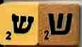
Really? These?
They look a little familiar...
Particularly, like stylized hebrew letters.
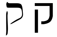
Entourage looks like a backwards "Peh"
Excel looks like "Aleph"
Powerpoint looks like "Qof"
Word looks like "Shin" (these are scrabble peices)
etc.
Joined: May 31, 2003 Posts: 219 Location: French Alps
Posted: Fri Jun 09, 2006 3:54 am Post subject:
Anonymous wrote:
Max_Barel wrote:
• The Office suite fo Mac icons have good graphics. This is may be the only good work in this package or even in all the M$ history, given the so bad quality/workmanship ratio of this company.
Really? These?
...
They look a little familiar...
Particularly, like stylized hebrew letters.
...
Good point, informative.
So, we are back on the ratio I was talking about…
No creativity, no talent, beside brute commercial force. _________________ Max
All times are GMT - 7 Hours Goto page 1, 2, 3 ... 20, 21, 22Next
Page 1 of 22
You cannot post new topics in this forum You cannot reply to topics in this forum You cannot edit your posts in this forum You cannot delete your posts in this forum You cannot vote in polls in this forum You cannot attach files in this forum You cannot download files in this forum